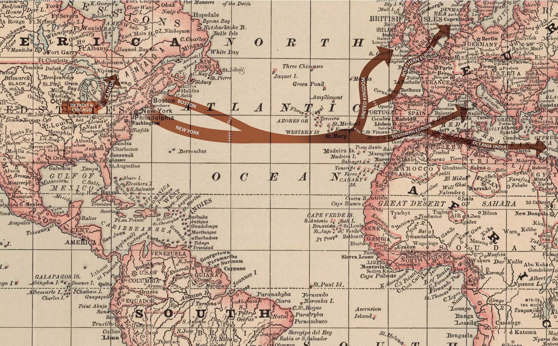
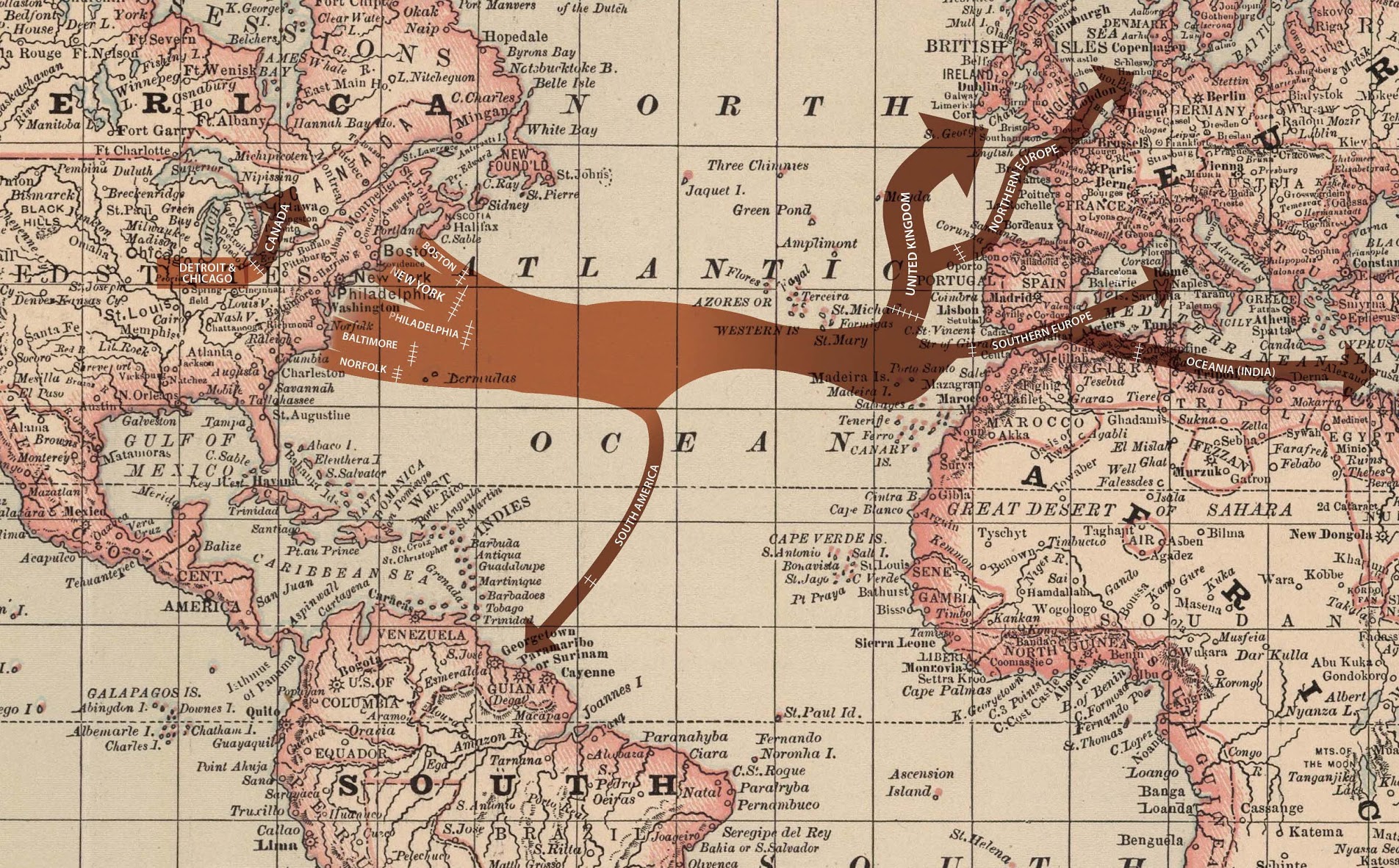
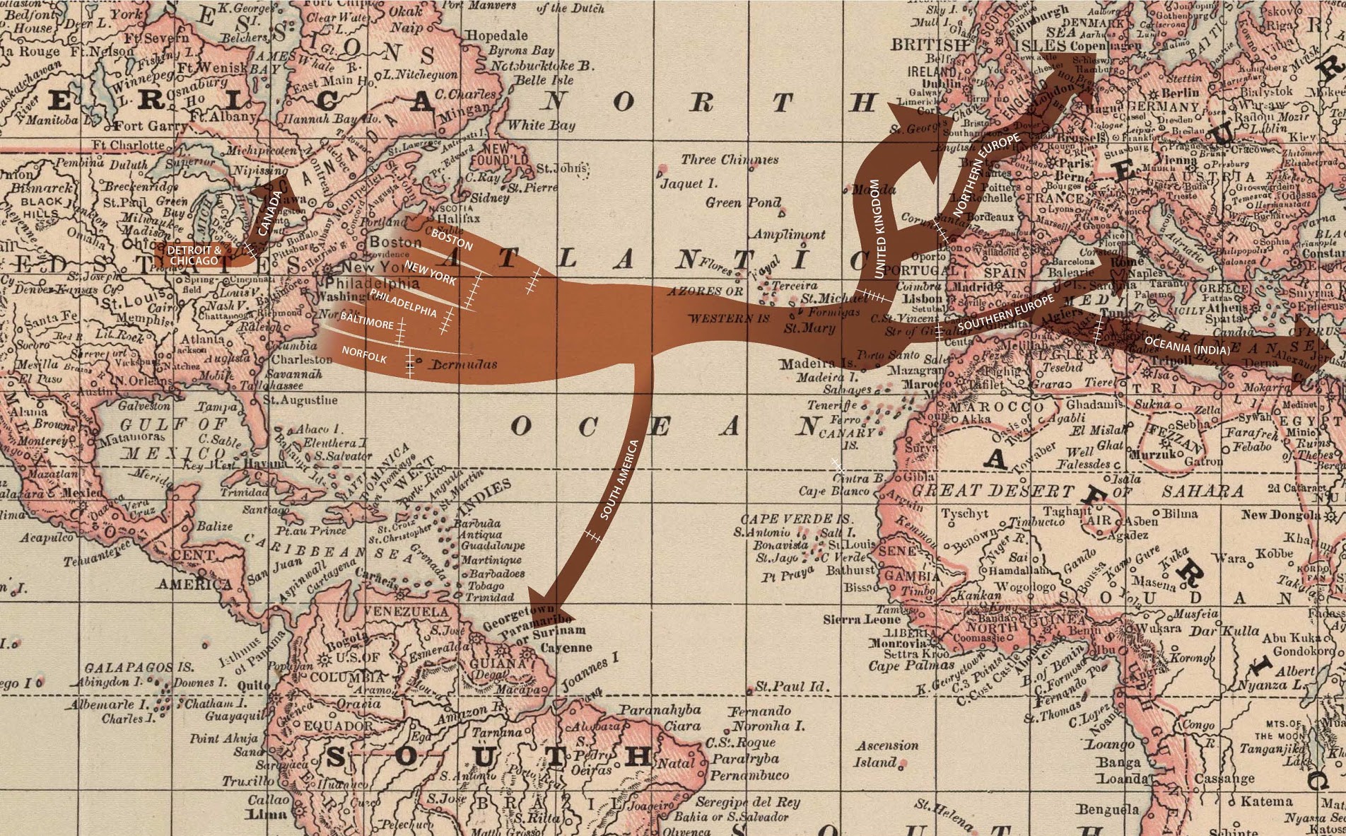

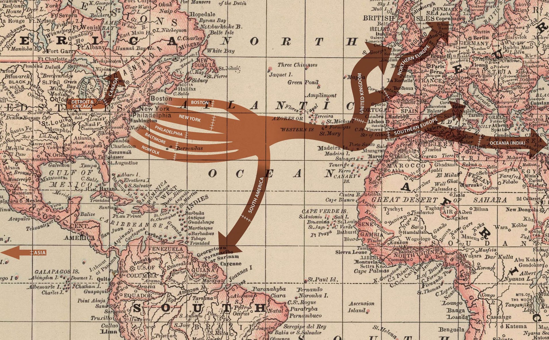
These maps show trends in the export flow of glucose from United States ports to the world from 1890 to 1910. Exporters shipped glucose (or “grape-sugar”) by the tens of millions of pounds throughout the later 1800s. The trade grew from three export ports in 1890 (Boston, New York, and Detroit) to six in 1910; it expanded from five global regional destinations to seven. In terms of quantity, the exports grew fifteen-fold from about 46 million to 728 million pounds in 1910. Some of the more notable trends are the increases in shipment to various South American countries by the early 1900s and shipments to new Asian markets beginning in 1905. The United Kingdom was such a large trading partner with the U.S. for glucose that their records offered more precision and, thus, the maps show direct flows to the UK while showing aggregated export streams to regions (Northern Europe, Southern Europe, South America) with less specificity in record keeping.
-
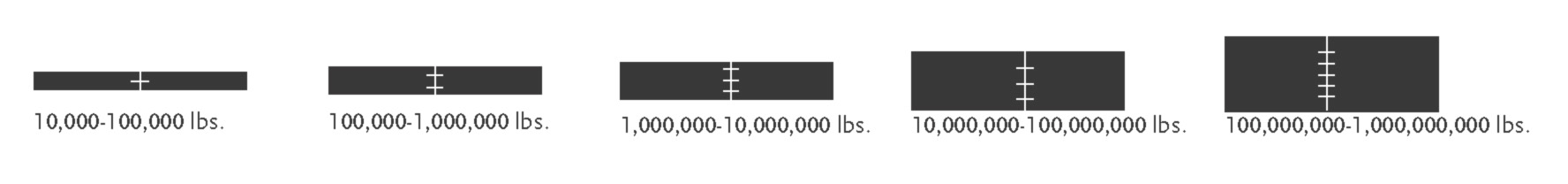
Because trade records provide a wide range of quantities per year, for the sake of reader legibility the maps represent proportions. For example, an arrow five-hatch-marks wide is five orders of magnitude greater than an arrow with one hatch mark, while the width of the five-hatch arrow is five times the width of the one-hatch arrow. Readers can thus view the maps to gain a sense of growth in export markets, relative quantities to various parts of the world, and sense of scale in the global marketplace for supposed adulterants.
-
The maps derive from government trade statistics that listed departure ports (export locations) and final destinations (import locations), but not together. For instance, while we know manufacturers shipped x pounds of glucose from New York in 1890, we do not know where, specifically, that specific quantity ended up. Therefore, the maps show the commodities shipped from individual U.S. ports to meet in the Atlantic before dispersing to final destinations.
-
In general, but not consistently, the government statistics used to construct theses maps documented foreign imports by country. Thus, in creating these maps the countries were aggregated into regions such as Northern Europe, Southern Europe, South America, Central America, Africa, and Asia. On the export side, various cities were aggregated into regions based on geographical proximity. The full data sets show specific nations.