
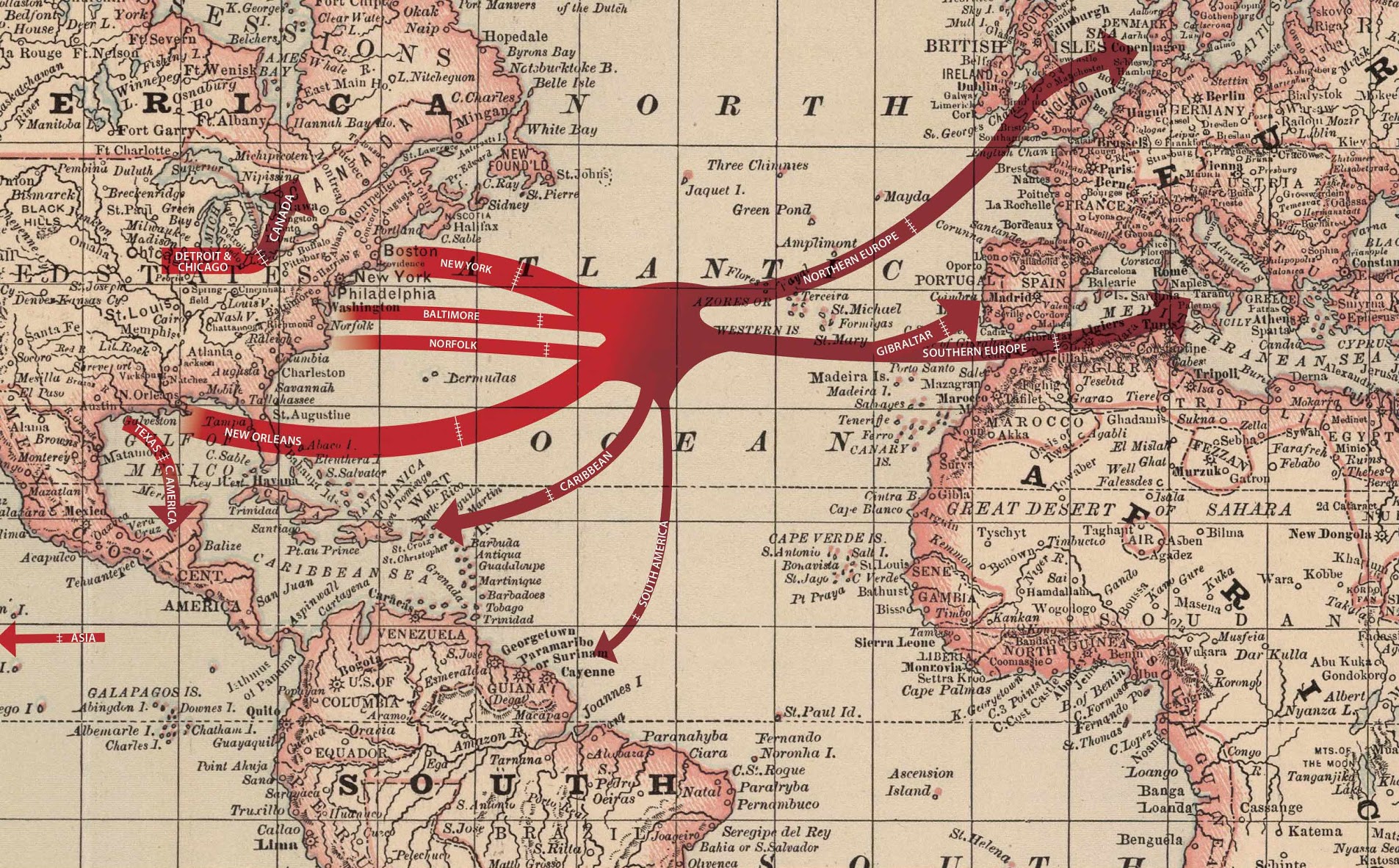

These maps show the export flow of cottonseed oil from U.S. ports to the world from 1880 to 1900. Overall, the trade grew from two export cities in 1880 (New York and New Orleans) to nine in 1900 and from six global regional destinations to nine. That was an increase from 8 million to over 260 million pounds. The largest export stream went to Southern Europe across all twenty years (principally Italy and southern France). By 1900, northern European nations (The Netherlands, Belgium, and the UK) played a bigger part in the trade. Note that trade records show the British holding of Gibraltar in 1880 and 1890, but then directly to the UK in 1900.
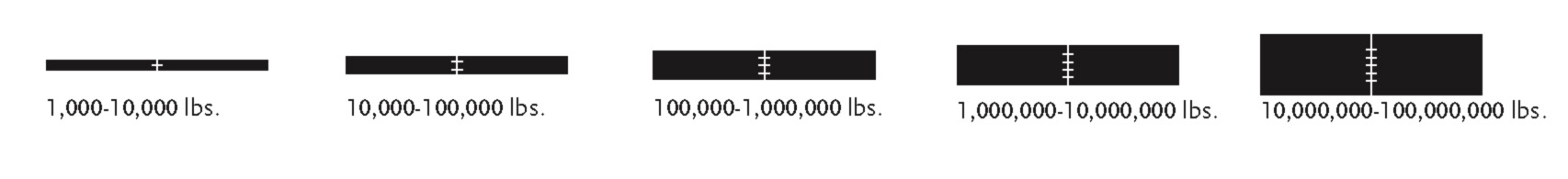
The width of the arrows represents the quantity of oil from tens of thousands to hundreds of millions of pounds. Because the specific locations (export locations) from trade records were too numerous to include with individual arrows, the maps show regional flows rather than specific national ones. Also note that inconsistency in record keeping leads to inconsistent labels for the export locations. Thus, some are continents, some are regions, and some are nations. We have sought to provide as much consistency as possible across the range of maps.
-
Because trade records provide a wide range of quantities per year, for the sake of reader legibility the maps represent proportions. For example, an arrow five-hatch-marks wide is five orders of magnitude greater than an arrow with one hatch mark, while the width of the five-hatch arrow is five times the width of the one-hatch arrow. Readers can thus view the maps to gain a sense of growth in export markets, relative quantities to various parts of the world, and sense of scale in the global marketplace for supposed adulterants.
-
The maps derive from government trade statistics that listed departure ports (export locations) and final destinations (import locations), but not together. For instance, while we know manufacturers shipped x pounds of cottonseed oil from New York in 1890, we do not know where, specifically, that specific quantity ended up. Therefore, the maps show the commodities shipped from each individual American port to meet in the middle of the Atlantic before dispersing to final destinations.
-
The government statistics used to generate these maps documented foreign imports by country. Thus, in creating the maps the countries were aggregated into regions such as Northern Europe, Southern Europe, South America, Central America, Africa, and Asia. On the export side, various cities were aggregated into regions based on geographical proximity.